decoupling
critical environmental thought in an esri story map
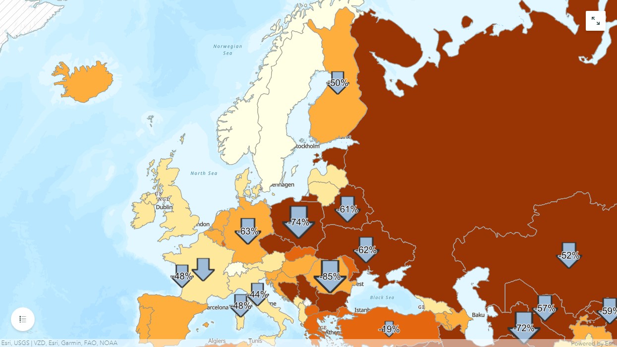
A poster for GIS Day 2021 related to the Millennium Development Goal of Ensuring Environmental Sustainability and related Story Map.
Stop reading and check out the Story Map!

More on this project: Produced in ArcGIS Pro, this poster presents global carbon intensity data from 1990-2018. The change in carbon intensity is symbolized using scaled arrow symbols. This data suggests some degree of eco-economic decoupling is taking place around the world (in simple terms, “doing more with less”). To raise the question of the adequacy of recent decoupling trends to address the climate crisis, per capita greenhouse gas emissions data over the same period are also presented (yellow-green outline).
Publication specifications: 18” x 24” print poster
Poster PDF (1.1 MB)